Last week I learnt how to use browse in photoshop to open an image. It's quicker and easier to use then having to search through your documents and is found in the file drop down menu. I also learned how to create an A4 canvas by selecting a new blank file and changing the settings to international paper before selecting A4, I then changed the resolution to 100 so the image didn't take up to much memory and changed it to CYMK so that it was printable. I then learned how to 'feather' an image, creating a ghost like effect. I did this by using the opaque marque tool to select a section of the image before dragging it away from the orginal image.
Three things I will consider for my film poster are the iconography, the colour and composition and the canvas set up. For iconography I'll use images and colours related to the thriller/horror genre, I'll also be using dark colours of black, red, white and greys, and will also use a lot of contrast to strengthen the images in my poster. The canvas will be A4 and will be CYMK so that it is printable and the resolution will 100 so it doesn't take up too much memory.
Tuesday, 28 September 2010
Friday, 24 September 2010
Week 3; Moodboard
Today I scanned my moodboard onto the computer and then annoted what I had done. I wrote about the colour theme for my mood board, why I had chosen the images I used, texts and what had influenced me for my own design. I made my annotations by using text layers before putting them all into one folder to make them easier to access, although it was hard to make the text any clearer than what I have done already, against the images on my moodboard.
Tuesday, 21 September 2010
WEEK 2: Skills Profile;
PHOTOSHOP
I have little knowledge of photoshop and pretty much just know the basics to simply edit a photo. Today I learned some shortcuts to help make things run quicker when I'm working on something and I also learned how to 'feather' using the opaque marque tool.
Shortcuts;
Rotation 90 degrees = ctrl+Z
Go back = ctrl + Alt +Z
Hue/Saturation = ctrl + U
Resize = ctrl + T
Deselect = ctrl + D
Notes;
*Rule of three.
*Colour wheel/palette - choose colours that fit with theme and compliment eachother. Choose opposites, e.g. green & purple.
Web designer depot.
RGB = For web use
CMYK = For printing
Resolution 100.
Friday, 17 September 2010
Mood board;
I cut out different images and texts from magazines that I could use for my mood board for one of my film poster ideas and also researched different fonts that I willl later print out and add to the board.After that I will stick everything on an A3 sheet of paper and add more images to it over the weekend to fill up the page with things related to the genre I'm doing.
WEEK 1: Film posters & DVD menu's
14/09/10
On Tuesday we sketched 3 idea's for a film poster we're going to make. After looking at a few examples I decided to sketch my ideas based on themes of horror, drama and a thriller/drama (One sketch for each genre).
Looking at different film posters I noticed that they all share similarites;
* Big bold title
* Leading actors/actresses names
* Credits along the bottom, inc. producer, director, production company etc.
* Date for release
* Tag line e.g The Orphan has the tag line 'There's something wrong with Esther'
My Ideas;
1. Horror; Background to be a picture of the woods, dark & misty, pair of 'wolves' eyes can be seen faintly in the middle of the woods, bright moon in the top right hand corner. The title; 'Wolf', will be big and bold, white with a possible glow effect, and will at the bottom of the poster, underneath the title there will be credits such as directors name, production company etc. Along the top of the poster will be the names of the leading actors/actresses.
2. Drama/Thriller; Untitled so far. Black background with a faint skyline of a rundown council estate/ london. Hooded figure standing centre point, only head can be seen, eyes covered by hoody. Title in white, along the top of the poster along with tag line underneath and actors names along the bottom in white.
3. Drama; Background of a pier/ the sea, title along the top left hand side of the page, decending. Actors names along bottom in black along with credits and tag line. Colours quite simple and neutral.
16/09/10
Wednesday; We looked at the DVD menu's for eight different films and made notes on what elements each menu contained and the codes and conventions for a DVD menu.
Functions & Elements;
*Buttons
*Images/ movinig images/ animation
*Text
*Visual/ sound effects
Codes & Conventions;
*Autoplay
*Writing speed
* Audio/ visual menu
*Subtitles/ text
* Regional Code
* Parental control
* Film logo/ production company logo.
* Scene selection - 4 chapter options to choose from in each section.
* There are often 4 choices to select from the menu, e.g, play, scene selection, special features etc.
Techniques & planning;
* Importing materials
*Timeline
*Chapterisation i.e scene selection
*Links
*Effects e.g rollover button
*Visual/ sound effects
Production & preparation;
*Storyboard
*Moving images & sound material
*Chapters
*Set forst play
*Build & burn.
DVD menu's I looked at; Forest Gump, Legally Blonde 2, Total Recall, Crash, Death Race, Fast Food Nation, Stranger than fiction & The Colour of Money.
Crash DVD menu analysis;

*Film company logo
*Four menu choices
*Plays again after 30 seconds (in a loop)
*Transitions- cuts off to next page with a new sequence.
*Background image of of film
*Scene in blocks of four (scene selection)
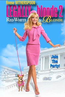
Legally Blonde 2 DVD menu analysis;

* Film company logo
*Feminine colours - blue, pink, yellow
*Clips shown in background - overlayed strip
*Selector is a blob that turns darker when something is selected
*Animation in boxes
*Smooth transitions accompanied by camera zoom sound
*Scenes shown in blocks of four (scene selection)
*Single image background
*Music loops after 15 seconds
*Bonus material
Forest Gump DVD menu analysis;

*Language select
*Film logo in background
*Copyright
*White feather animation
*Ping pong ball animation
* Five different menu choices
*Features music from film
*Film automatically plays after 30 seconds
*Underline appears when something is selected
*Scenes shown in blocks of 4 on each page (scene selection)
Total Recall DVD menu analysis;

*Film company logo
*Dark colours -blue, red, silvers, black,
*Audio from film
*Animation - Skull
*Copyright
*Blod text
*Scenes shown in blocks of 4 (scene selection)
*Language select
*Animated skull
*Clips from film
On Tuesday we sketched 3 idea's for a film poster we're going to make. After looking at a few examples I decided to sketch my ideas based on themes of horror, drama and a thriller/drama (One sketch for each genre).
Looking at different film posters I noticed that they all share similarites;
* Big bold title
* Leading actors/actresses names
* Credits along the bottom, inc. producer, director, production company etc.
* Date for release
* Tag line e.g The Orphan has the tag line 'There's something wrong with Esther'
My Ideas;
1. Horror; Background to be a picture of the woods, dark & misty, pair of 'wolves' eyes can be seen faintly in the middle of the woods, bright moon in the top right hand corner. The title; 'Wolf', will be big and bold, white with a possible glow effect, and will at the bottom of the poster, underneath the title there will be credits such as directors name, production company etc. Along the top of the poster will be the names of the leading actors/actresses.
2. Drama/Thriller; Untitled so far. Black background with a faint skyline of a rundown council estate/ london. Hooded figure standing centre point, only head can be seen, eyes covered by hoody. Title in white, along the top of the poster along with tag line underneath and actors names along the bottom in white.
3. Drama; Background of a pier/ the sea, title along the top left hand side of the page, decending. Actors names along bottom in black along with credits and tag line. Colours quite simple and neutral.
16/09/10
Wednesday; We looked at the DVD menu's for eight different films and made notes on what elements each menu contained and the codes and conventions for a DVD menu.
Functions & Elements;
*Buttons
*Images/ movinig images/ animation
*Text
*Visual/ sound effects
Codes & Conventions;
*Autoplay
*Writing speed
* Audio/ visual menu
*Subtitles/ text
* Regional Code
* Parental control
* Film logo/ production company logo.
* Scene selection - 4 chapter options to choose from in each section.
* There are often 4 choices to select from the menu, e.g, play, scene selection, special features etc.
Techniques & planning;
* Importing materials
*Timeline
*Chapterisation i.e scene selection
*Links
*Effects e.g rollover button
*Visual/ sound effects
Production & preparation;
*Storyboard
*Moving images & sound material
*Chapters
*Set forst play
*Build & burn.
DVD menu's I looked at; Forest Gump, Legally Blonde 2, Total Recall, Crash, Death Race, Fast Food Nation, Stranger than fiction & The Colour of Money.
Crash DVD menu analysis;
*Film company logo
*Four menu choices
*Plays again after 30 seconds (in a loop)
*Transitions- cuts off to next page with a new sequence.
*Background image of of film
*Scene in blocks of four (scene selection)
Legally Blonde 2 DVD menu analysis;

* Film company logo
*Feminine colours - blue, pink, yellow
*Clips shown in background - overlayed strip
*Selector is a blob that turns darker when something is selected
*Animation in boxes
*Smooth transitions accompanied by camera zoom sound
*Scenes shown in blocks of four (scene selection)
*Single image background
*Music loops after 15 seconds
*Bonus material
Forest Gump DVD menu analysis;
*Language select
*Film logo in background
*Copyright
*White feather animation
*Ping pong ball animation
* Five different menu choices
*Features music from film
*Film automatically plays after 30 seconds
*Underline appears when something is selected
*Scenes shown in blocks of 4 on each page (scene selection)
Total Recall DVD menu analysis;
*Film company logo
*Dark colours -blue, red, silvers, black,
*Audio from film
*Animation - Skull
*Copyright
*Blod text
*Scenes shown in blocks of 4 (scene selection)
*Language select
*Animated skull
*Clips from film
Sunday, 12 September 2010
08/09/10 - Grown Ups;
http://www.youtube.com/watch?v=t80--iojYDQ&feature=channel
Today was the third day of the induction period for college and after spending the morning analysing different film posters and coming up with an idea for one to make yourself, we went to the cinema to see Grown Ups. From the trailer it looked like a pretty funny movie all around and something that everyone would enjoy, however I think it would be more appealing to an older audience of young teens and above as most of the humour is more adult/ teen friendly.
Subscribe to:
Comments (Atom)

