On Tuesday we sketched 3 idea's for a film poster we're going to make. After looking at a few examples I decided to sketch my ideas based on themes of horror, drama and a thriller/drama (One sketch for each genre).
Looking at different film posters I noticed that they all share similarites;
* Big bold title
* Leading actors/actresses names
* Credits along the bottom, inc. producer, director, production company etc.
* Date for release
* Tag line e.g The Orphan has the tag line 'There's something wrong with Esther'
My Ideas;
1. Horror; Background to be a picture of the woods, dark & misty, pair of 'wolves' eyes can be seen faintly in the middle of the woods, bright moon in the top right hand corner. The title; 'Wolf', will be big and bold, white with a possible glow effect, and will at the bottom of the poster, underneath the title there will be credits such as directors name, production company etc. Along the top of the poster will be the names of the leading actors/actresses.
2. Drama/Thriller; Untitled so far. Black background with a faint skyline of a rundown council estate/ london. Hooded figure standing centre point, only head can be seen, eyes covered by hoody. Title in white, along the top of the poster along with tag line underneath and actors names along the bottom in white.
3. Drama; Background of a pier/ the sea, title along the top left hand side of the page, decending. Actors names along bottom in black along with credits and tag line. Colours quite simple and neutral.
16/09/10
Wednesday; We looked at the DVD menu's for eight different films and made notes on what elements each menu contained and the codes and conventions for a DVD menu.
Functions & Elements;
*Buttons
*Images/ movinig images/ animation
*Text
*Visual/ sound effects
Codes & Conventions;
*Autoplay
*Writing speed
* Audio/ visual menu
*Subtitles/ text
* Regional Code
* Parental control
* Film logo/ production company logo.
* Scene selection - 4 chapter options to choose from in each section.
* There are often 4 choices to select from the menu, e.g, play, scene selection, special features etc.
Techniques & planning;
* Importing materials
*Timeline
*Chapterisation i.e scene selection
*Links
*Effects e.g rollover button
*Visual/ sound effects
Production & preparation;
*Storyboard
*Moving images & sound material
*Chapters
*Set forst play
*Build & burn.
DVD menu's I looked at; Forest Gump, Legally Blonde 2, Total Recall, Crash, Death Race, Fast Food Nation, Stranger than fiction & The Colour of Money.
Crash DVD menu analysis;
*Film company logo
*Four menu choices
*Plays again after 30 seconds (in a loop)
*Transitions- cuts off to next page with a new sequence.
*Background image of of film
*Scene in blocks of four (scene selection)
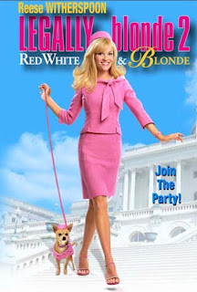
Legally Blonde 2 DVD menu analysis;

* Film company logo
*Feminine colours - blue, pink, yellow
*Clips shown in background - overlayed strip
*Selector is a blob that turns darker when something is selected
*Animation in boxes
*Smooth transitions accompanied by camera zoom sound
*Scenes shown in blocks of four (scene selection)
*Single image background
*Music loops after 15 seconds
*Bonus material
Forest Gump DVD menu analysis;
*Language select
*Film logo in background
*Copyright
*White feather animation
*Ping pong ball animation
* Five different menu choices
*Features music from film
*Film automatically plays after 30 seconds
*Underline appears when something is selected
*Scenes shown in blocks of 4 on each page (scene selection)
Total Recall DVD menu analysis;
*Film company logo
*Dark colours -blue, red, silvers, black,
*Audio from film
*Animation - Skull
*Copyright
*Blod text
*Scenes shown in blocks of 4 (scene selection)
*Language select
*Animated skull
*Clips from film
No comments:
Post a Comment